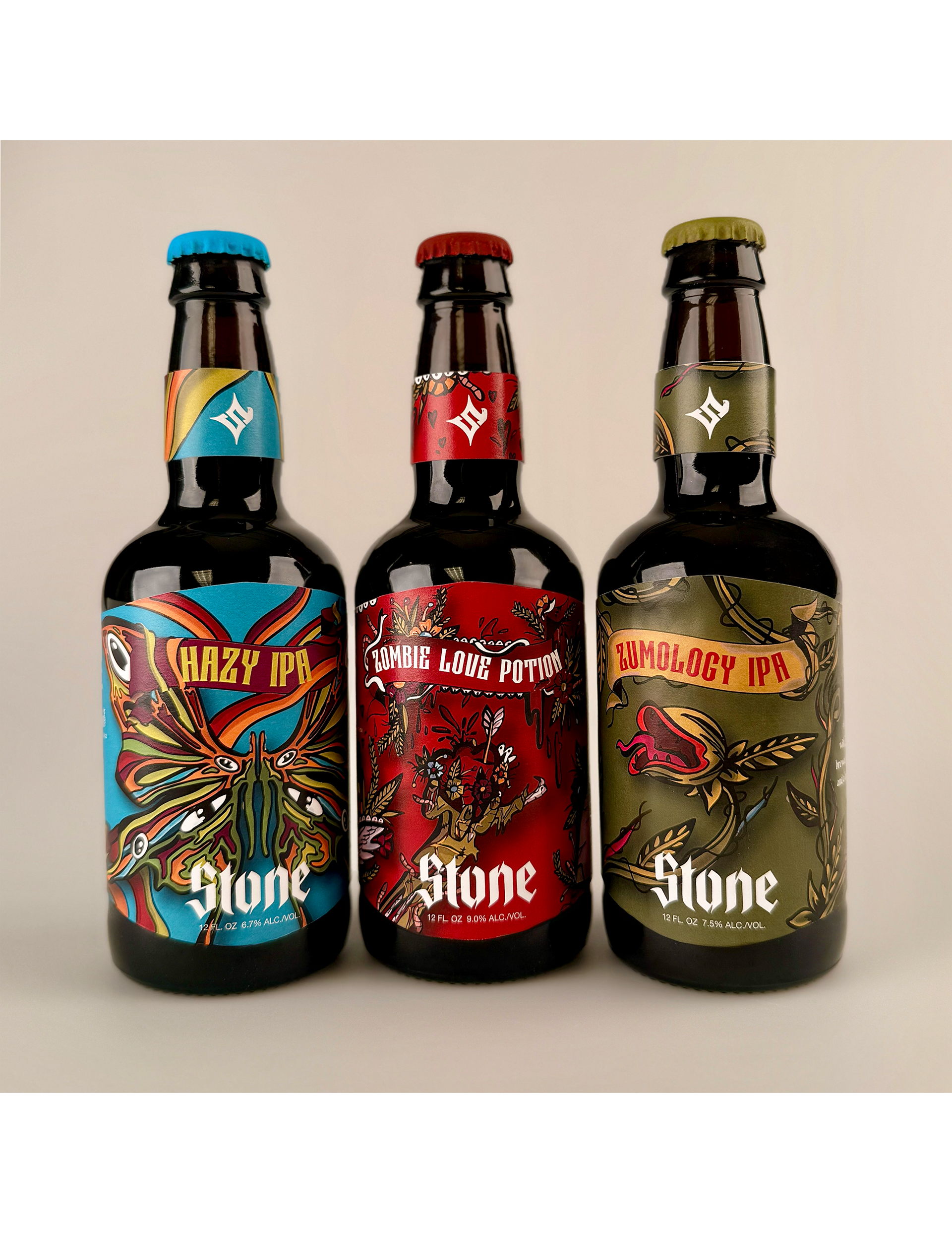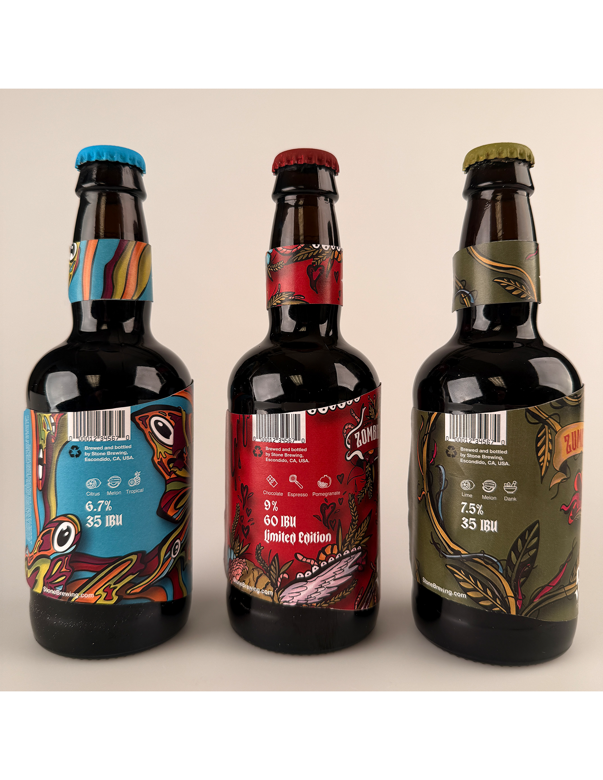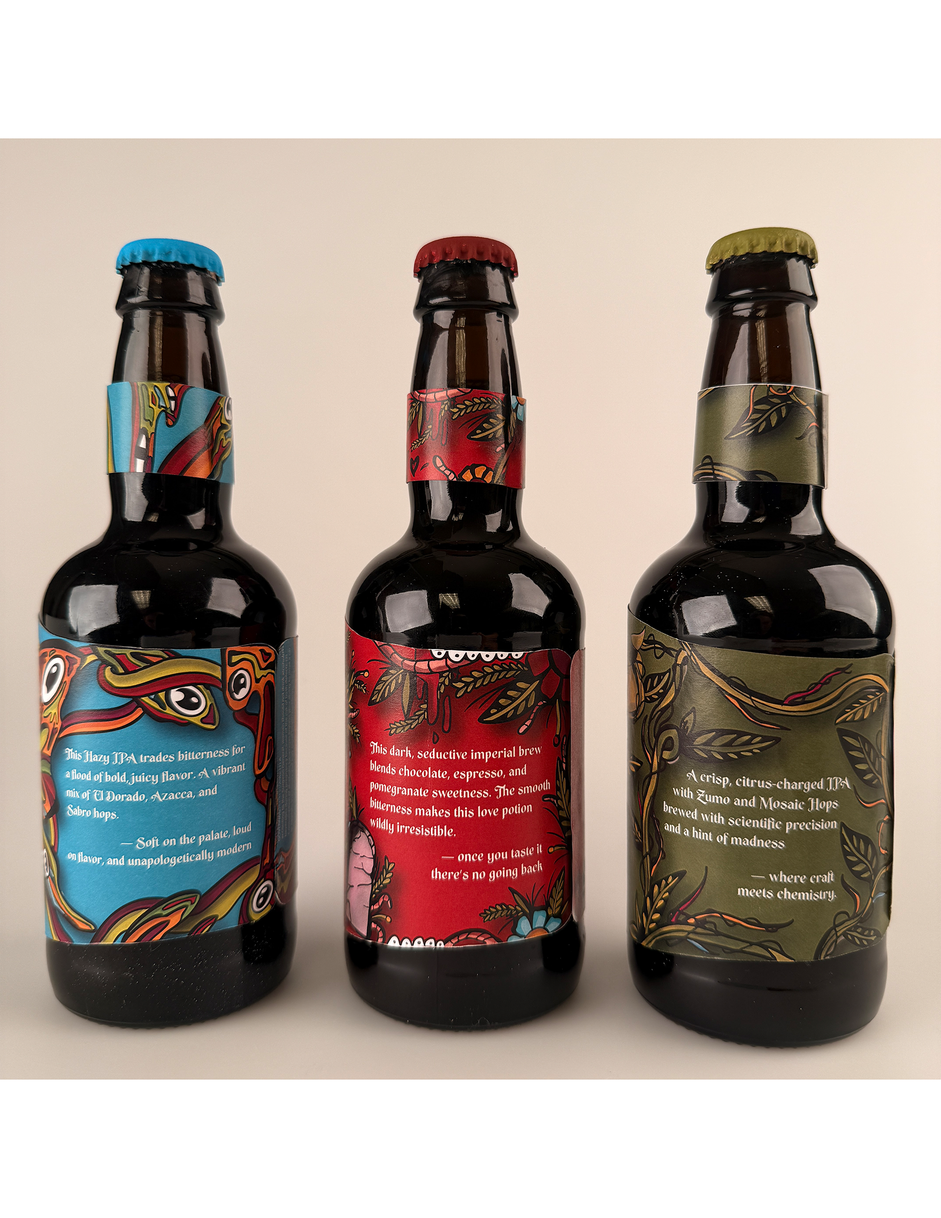
Stone Brewing is a real brand I chose to redesign because its attitude, visuals, and bold flavor profiles felt genuinely inspiring. My goal was to create packaging and a new brand mark and logotype that reflects the brand’s unapologetic character while introducing a fresh visual system driven by American Traditional tattoo art. Each label has its own personality, rooted in the flavor’s theme, yet all three stay connected through color, typography, and illustration style. The medieval touches and gargoyle-inspired elements reinforce Stone’s legacy, adding depth and continuity. Together, the designs aim to elevate the bottles into a cohesive, collectible set that celebrates the brand’s intensity, craft, and unmistakable edge.